
以自由意志為本 打造亞洲非籠飼雞蛋品牌
雙好設計操刀臺灣非籠飼雞蛋指標品牌《自遊雞 Fregg》
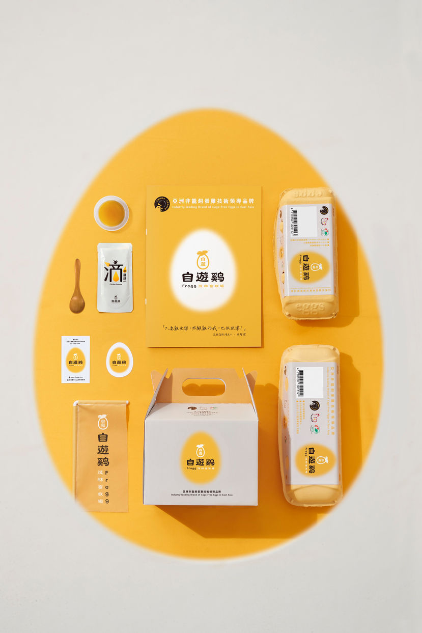
「自由生活的母雞,才孕育的出非籠飼雞蛋。自在悠遊不僅是對雞隻生活環境與飼養技術的提升,自由意志更是這個時代共通的精神。」雙好設計與位於苗栗,耕耘非籠飼蛋雞飼養技術多年的茂林畜牧場合作,以「自由意志」作為全新雞蛋品牌的核心價值,整合自由(Free)與 雞蛋(Egg),推出名為《自遊雞 Fregg》的非籠飼雞蛋品牌,也期許賣場貨架上的非籠飼雞蛋,能逐漸成為我們日常食品選擇的消費態度。
近年,符合雞隻習性與動物福利的飼養觀念,已成為全球從農業發展到消費生活、零售通路等無不關注且倡議的焦點,「非籠飼」是母雞從傳統飼養的A4格籠踏出籠外的一小步,同時也是臺灣非籠飼技術、動物福利與環境永續的一大步。今年透過農委會與台灣設計研究院TGA專案,雙好設計也希望傳遞「品牌主無時無刻與蛋雞視線平行」的企業視野與對永續經營的精神,在解放蛋雞的整體企業轉型中,從「友善雞蛋」的標章,延展出產業與市場都有意識的消費選擇。
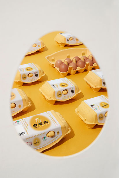
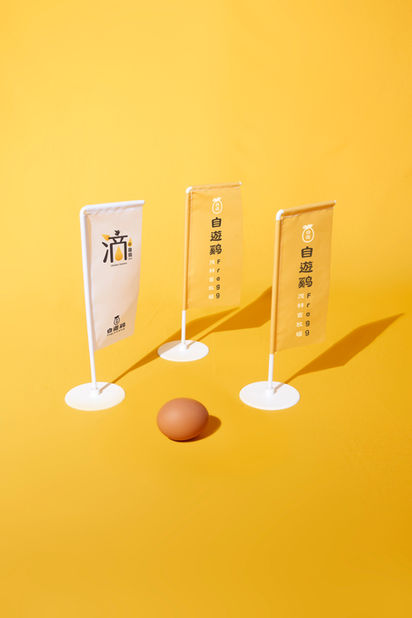
設計焦點上,雙好設計團隊在農場與產業的經營脈絡中,將蛋黃透亮的黃色、雞羽毛棕色,以及象徵自由的純淨白色作為品牌識別色,除呼應「自在悠遊」的企業精神,蛋型與輕盈羽毛的品牌識別,也緊扣《自遊雞 Fregg》蛋盒中,每顆雞蛋都從自在生活的母雞而來,「自由是一種精神,蛋型與光暈帶著一股向陽、充滿希望的動力,這是品牌的核心價值,也是整個雞蛋產業在臺灣的近程目標。」雙好設計透過孕育《自遊雞 Fregg》的企業識別與產品包裝,也反覆琢磨如何將「非籠飼」的產業趨勢,從產業與產地,帶入消費市場與你我餐桌。
Building an Asian non-cage-fed egg brand based on welfare and freedom
2byWu&Chen directs the design of Taiwan's Industry-leading Brand of cage-free eggs, "Fregg"
"Only free-living hens can produce non-cage-fed eggs. Freedom is an improvement to the living environment and breeding techniques of chickens. It is also the common spirit of this era." 2byWu&Chen cooperates with Mao-lin animal welfare poultry farm located in Miaoli, which has many years of non-cage-fed layer breeding technology. Using "freedom" as the core value of the new egg brand, integrating Free and Egg, and launching the cage-free eggs "Fregg", hoping that these eggs would gradually become our primary choice for daily needs.
In recent years, the concept of breeding in line with chicken habits and animal welfare has become the focus of global attention and initiatives from agricultural development to consumer choices, retail channels. "Cage-free breeding" means that hens are not raised within the traditional A4 size cages. This might seem like a small step for a hen to step out of the cage, but it is an essential step for Taiwan's non-cage feeding technology, animal welfare, and environmental sustainability. This year, through the TGA project of the Council of Agriculture and the Taiwan Design Research Institute, 2byWu&Chen also hopes to convey the corporate vision that the "brand owners are always paying attention to the needs of laying hens" and the spirit of sustainable management. The overall corporate transformation of the liberation of laying hens, from the "welfare eggs" label, and extending to the industry and market's conscious consumer choices.
In terms of design focus, the 2byWu&Chen team used translucent yellow to represent egg yolks, brown as chicken feathers, and pure white, symbolizing freedom as brand identification colors. In addition to echoing the corporate spirit of "freedom", the brand identity uses eggs and feathers that are closely linked to the "Fregg" egg box. Each egg comes from a hen who lives freely. "Freedom is a spirit. The egg shape and halo represents positivity, hopeful and motivation, this is the core value of the brand and the goal of the entire egg industry in Taiwan." 2byWu&Chen uses the corporate identity and product packaging that nurtured "Fregg", and repeatedly pondered how to integrate the cage-free industry trend, from industry and production to the consumer market that includes you and me.
Client /
茂林畜牧場
行政院農業委員會
台灣設計研究院
Role /
CI Design
Package Design
Year /
2021


