草山好土氣 GrassHill Living
品牌識別設計
「草山好土氣」以「農藝新浪潮」為核心精神,作為陽明山生活文化據點的識別與品牌核心。
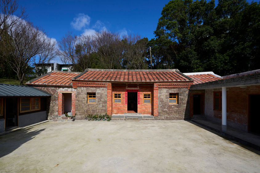
視覺設計從巫雲山莊的環境敘事展開:草山地景、老屋質地、田埂肌理與山光日月構成的生活風景,轉化為幾何與手繪並行的語言,象徵農業與文化在當代並行的面貌。
設計概念
標誌以「山」為題、以「屋」為心,凝縮草山的地貌特徵與老屋文化的根基;搭配日(月)光的圓形符號,象徵生命循環、時間流動與土地的再生力。
整體圖形以當代幾何構成維持秩序感,而筆觸、色塊與線條仍保留手感溫度,形成「新與舊」「自然與文化」相互並存的視覺語境。
色彩意象
土紅:老屋磚瓦與土地色澤,象徵農藝根基。
草綠:山林植栽的延綿生命力。
金褐:秋收、歲月與農藝的厚度。
暮紫/晨光:山區天光在日夜循環中的變化,呼應陽明山的自然節奏。
視覺語彙
透過幾何比例與手繪質地的交錯運用,建立一套能延伸至空間、導視、出版與活動應用的識別系統,使「草山好土氣」成為連結地方農業、生活文化與自然美學的全新語言。
Brand Identity Design
GrassHill Living is founded on the spirit of “Agrarian New Wave,” serving as a contemporary lifestyle and cultural hub on Yangmingshan.
Inspired by the setting of Wuyun Mountain Villa, the identity draws from the mountain landscape, historic houses, field textures, and the shifting light of sun and moon. These elements are translated into a visual language that combines geometric structure with hand-drawn qualities, expressing the coexistence of agriculture and culture today.
Design Approach
The logo is shaped by the form of the mountain and centered on the idea of home, symbolizing both place and cultural roots. A circular sun/moon motif represents cycles of life, time, and renewal.
Balancing precise geometry with tactile lines and colors, the system reflects a dialogue between tradition and contemporaneity, nature and culture.
Visual System
Designed for flexibility, the identity extends across spatial applications, wayfinding, publications, and events, forming a cohesive visual language that connects local agriculture, everyday life, and nature-based aesthetics.
Client /
臺北市農會
草山好土氣
Role /
Brand Concept
Brand Strategy
CI/VI Design
Applications Design
Year /
2025


